NYC COVID-19 Portal
Reimagining the city’s COVID-19 information portal and vaccine finder
When COVID-19 vaccines first became available for New Yorkers in early 2021, residents depended on NYC.gov’s Vaccine Portal to inform them about availability, eligibility, and to schedule vaccine appointments through its Vaccine Finder.
But keeping New Yorkers informed about COVID-19 vaccination-related issues, and connecting them with appointments, presented many logistical challenges.
Roles
This is a concept project where I assumed the following roles:
Interaction (IxD) Designer
User Experience (UX) Designer
User Interface (UI) Designer
Deliverables
Interaction Design: High-fidelity interactive prototypes for key tasks on desktop, mobile, and kiosk
UX/UI Design:
Competitive analysis
User surveys and one-on-one interviews
Site map
Personas
UI kit
Low-fidelity wireframes
High-fidelity mockups and prototypes
Usability tests and findings
Project Specifications
Duration: 6 weeks
Tools:
Figma
Whimsical
OptimalSort
Octopus
Photoshop
Illustrator
Overview
In early 2021, the city began an aggressive push to vaccinate New Yorkers when COVID-19 vaccines first became available. It had already set up a COVID-19 Vaccine “Portal” and a “Vaccine Finder,” which enabled users to search for vaccination appointments by location.
Problems arose, however, when residents tried to secure appointments. Every vaccination center in the Vaccine Finder had its own appointment system, and none of those systems communicated with each another. There was also no means of knowing which centers actually had available appointments.
As a result, if users were even able to find a Vaccine Finder appointment, they often had to fill out a lengthy application only to find out the appointment wasn’t available. This process had to be repeated with every vaccination site: each drugstore chain, each city-sponsored site, every hospital and every clinic.
Making matters worse, it quickly became clear that accessibility was an issue. The first group of those eligible were senior citizens, and countless stories began to surface of younger family members having to spend hours online or on the phone, trying to secure appointments for their parents or grandparents, who were unable to negotiate this complicated process by themselves.
Problems
Vaccine availability was spread across hundreds of distribution points, each with its own unique appointment system.
Information about vaccinations on the NYC.gov Vaccine Portal was often buried and difficult to find.
The city’s website and appointment system did not address homeless residents, or those with little digital experience or access.
Proposed Solutions
Redesign the city’s Vaccine Finder as a single appointment system, communicating through a back-end solution that regularly scrapes all vaccine center appointments.
Reimagine the NYC.gov Vaccine Portal with prioritized vaccination information.
Address accessibility for the homeless and those with limited digital experience.
Research
I started my research with competitive analysis in order to understand the approaches of the country’s largest city government websites. I also wanted to identify functional and usability gaps by looking at alternative solutions. User surveys would help me understand what COVID-19 vaccination-related information is most important to residents, so I could prioritize it. And lastly, one-on-one interviews could help me uncover users’ journeys in finding and securing appointments, and help identity their pain points.
Findings
Residents wanted a single appointment system that would take them from start (finding an appointment) to finish (booking an appointment).
Being able to filter appointments was important — first by location, then by other vaccination details.
Homegrown solutions such as TurboVax and The New York City Vaccine List attempted to compensate for NYC.gov’s inability to find available appointments, but fell short of being able to aggregate all disparate appointment systems.
The most important information on NYC.gov was related to COVID-19 vaccinations and eligibility, followed by guidelines.
Appointment access via phone numbers and public kiosks (LinkNYC) could help address the need for wider access (e.g., homeless individuals or people with limited digital access).
NYC residents wanted a single appointment system that would take them from start (finding an appointment) to finish (booking an appointment).
Developing Empathy with NYC Residents
Because the audience for this project was so wide (every NYC resident), I felt it was important to try and represent as many people as possible through two personas. These were designed by cross referencing quantitative and qualitative data from my user surveys and interviews with official demographic data. They would serve as important reference points for design decisions moving forward. For both “Alaya” and “Wojciech”:
They may be first or second generation immigrants
English may or may not be their first language
The ability to navigate complex digital transactions can range from novice to expert
They may be responsible for securing vaccination appointments for family members
Median age is mid- to late-30s, but can skew older
Building a Framework for Design
This site map, the result of the surveys, interviews, and card sorting exercises I conducted, revealed that:
Residents mostly visited the city’s COVID-19 Vaccine Portal to understand eligibility, and to make vaccination appointments
They wanted a single appointment process that was easy to understand
COVID-related guidelines were of lesser importance
Defining Important Tasks
Users said that once they were eligible, they wanted to identify a vaccine appointment quickly (with priority given to location) and then input the information needed to secure that appointment — all within a few clicks from the Vaccine Portal landing page. This task flow depicts that optimized and linear journey.
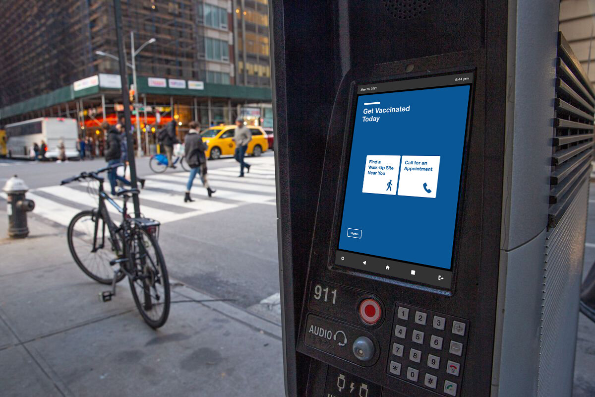
A second task flow for outdoor kiosks simplifies the process for those who may be homeless or without digital access; it removes the need to provide any personal information, and provides nearby walk-in site addresses, or connects directly to phone support.
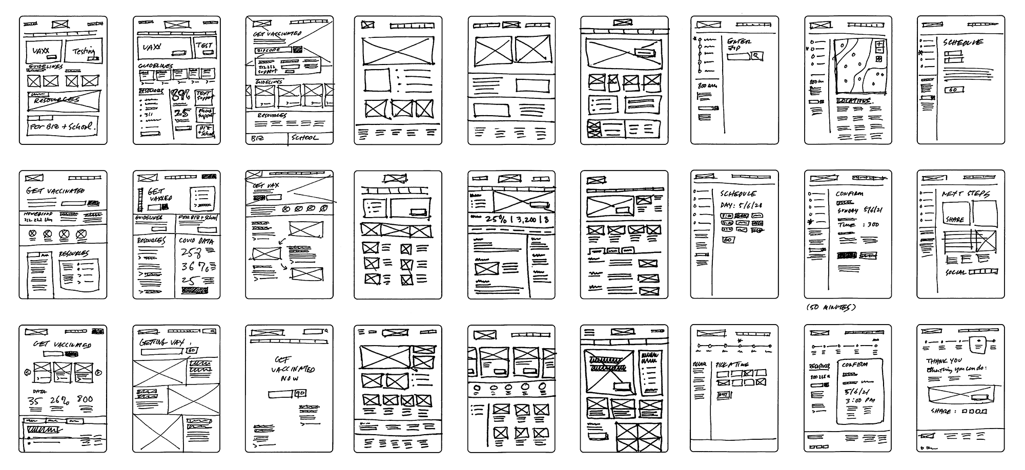
Identifying Design Patterns Through Rapid Sketching
By exploring page organization through sketching, I learned that the best way forward was through very clearly organized modules that featured ample negative space, and predictable design patterns specific to information browsing or moving through the appointment flow.
Designing Information Hierarchy
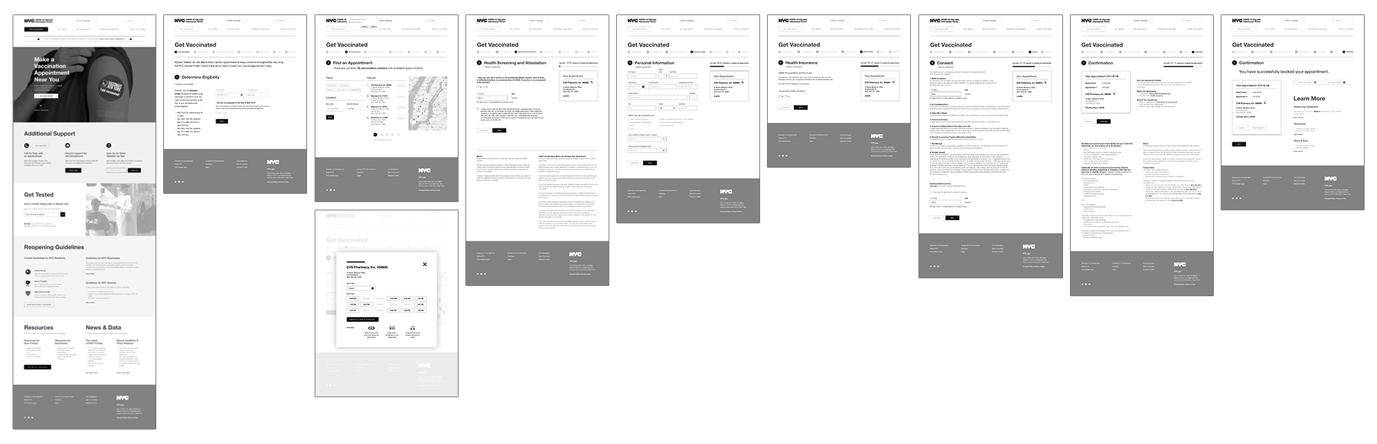
Due to time constraints, I went directly from sketching to greyscale high fidelity prototypes. Working in black and white helped me uncover problems with scale and information hierarchy. And designing responsive mobile wireframes in this mode helped me make decisions about what elements could be made secondary because of space.
By testing these wireframes I discovered problems users had with some of the language, as well as functions they were expecting but were missing.
Clarifying Visual Design
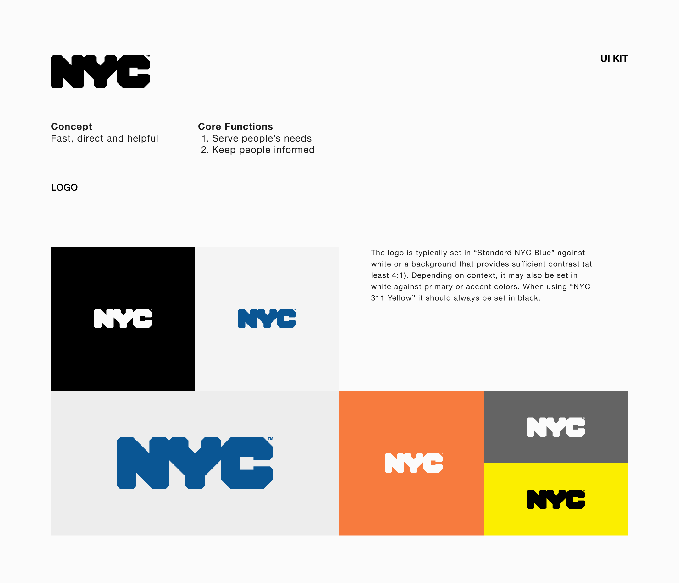
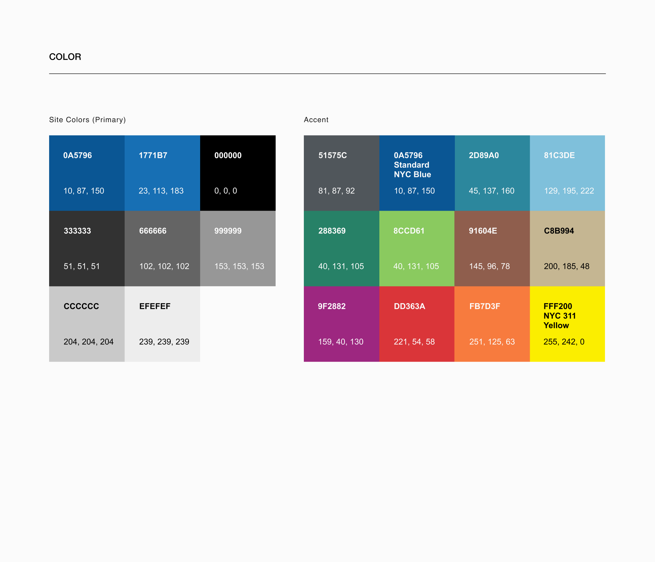
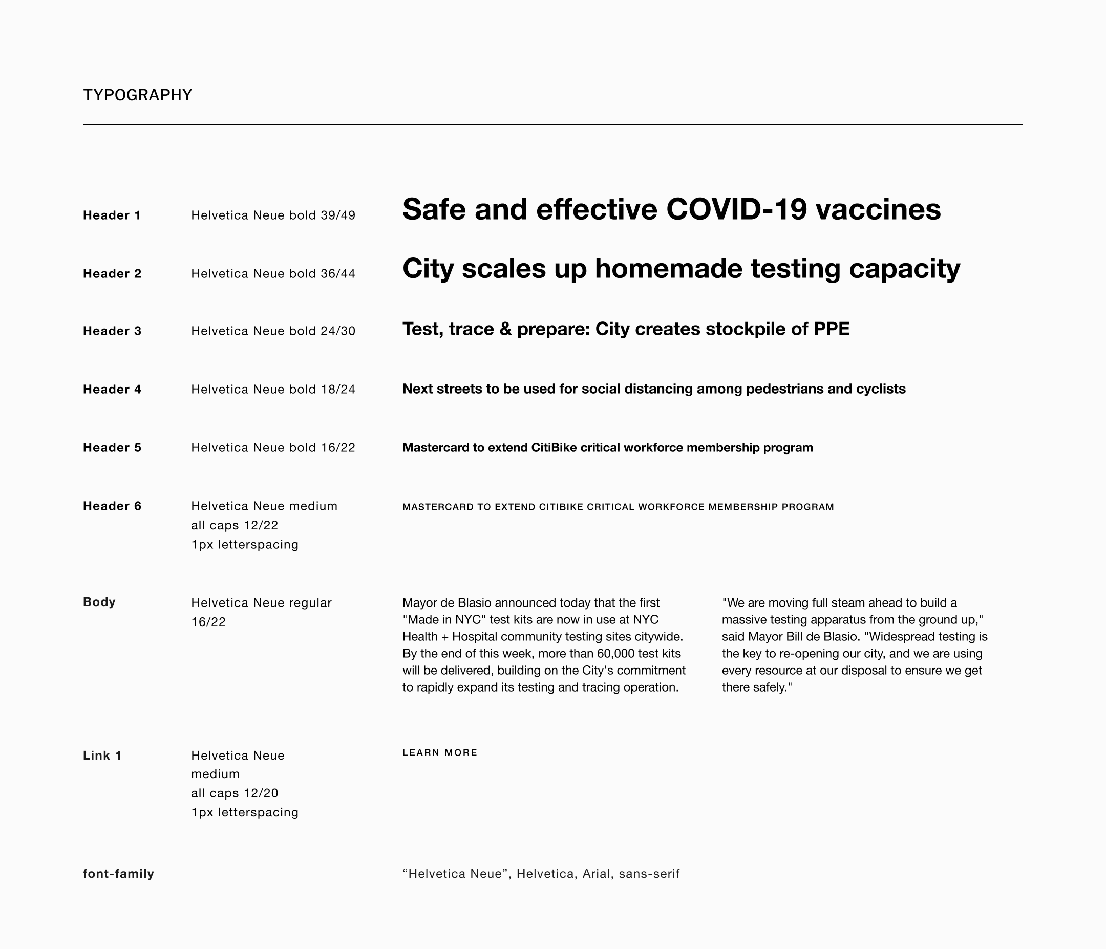
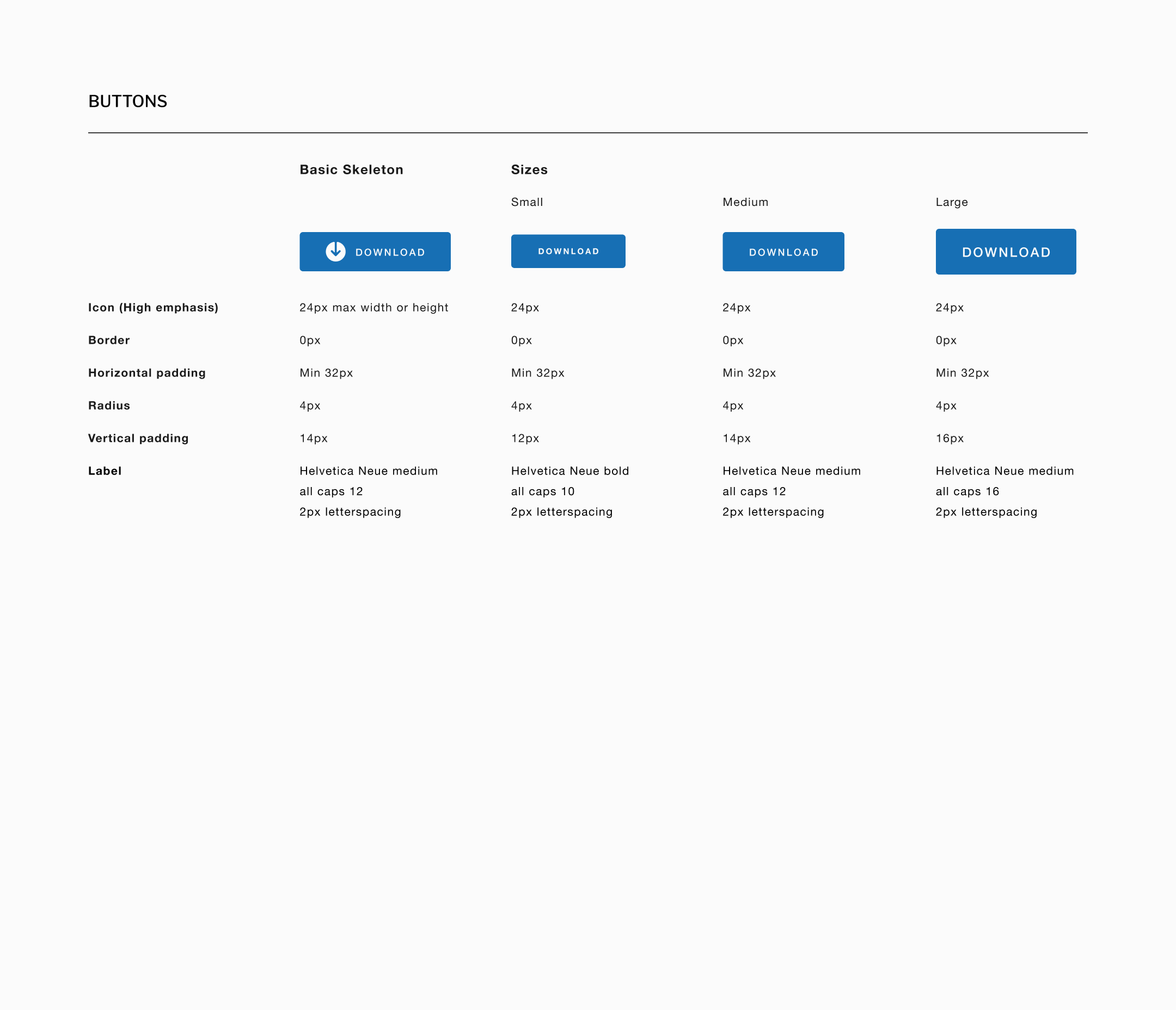
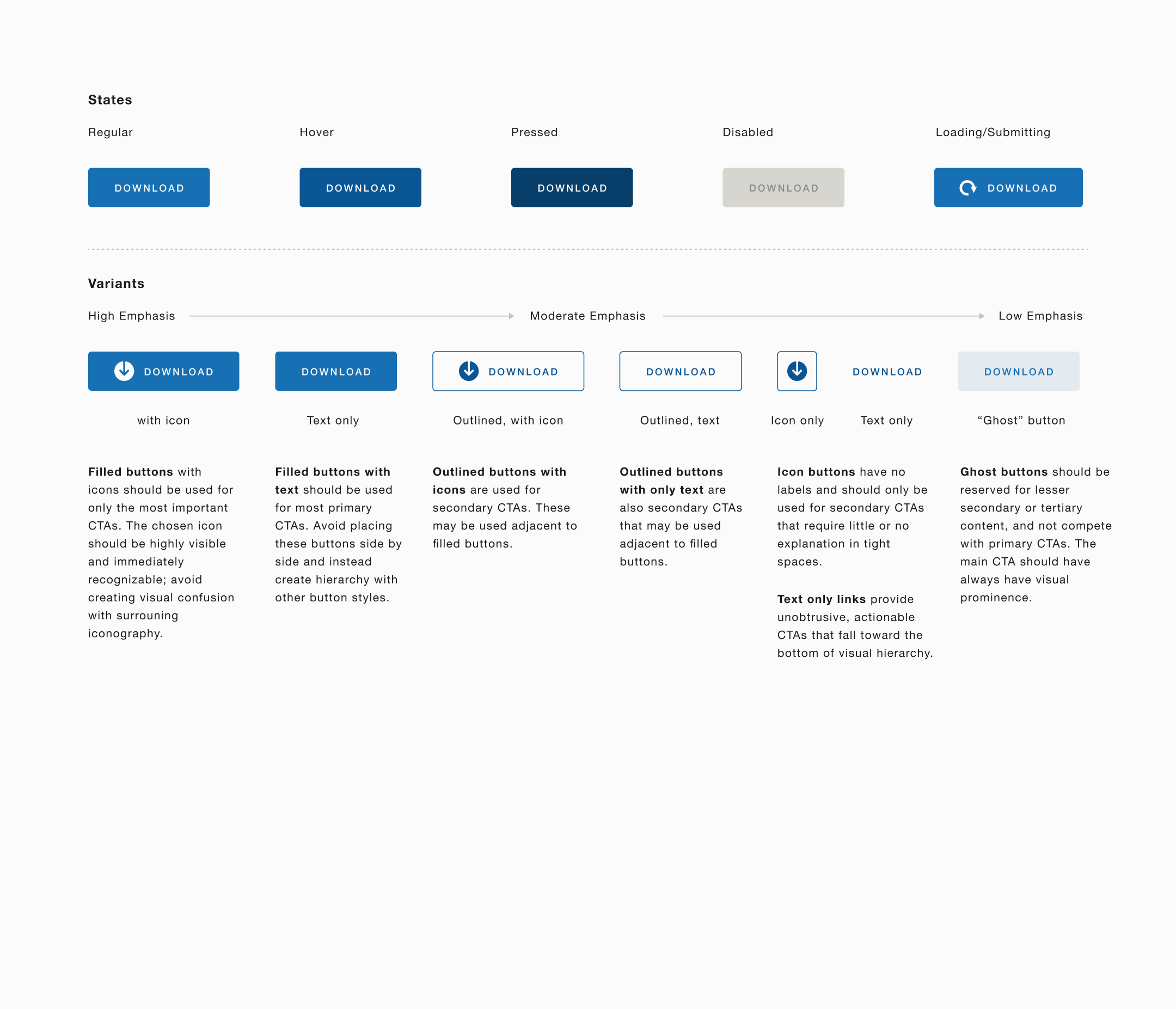
While NYC.gov’s Information Technology & Telecommunications group has a set of guidelines for user experience, it hadn’t been updated since 2015. It does cover topics such as color, typography, grids, and photography, but only from a very high-level perspective.
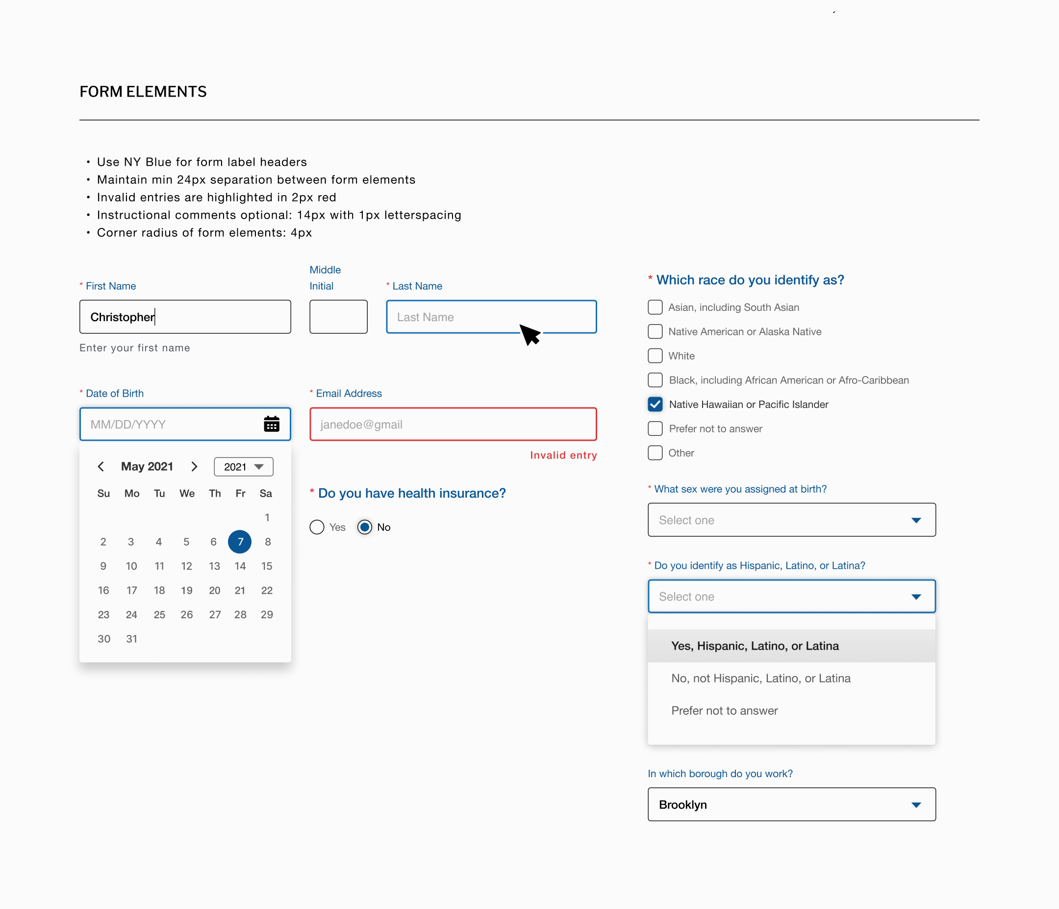
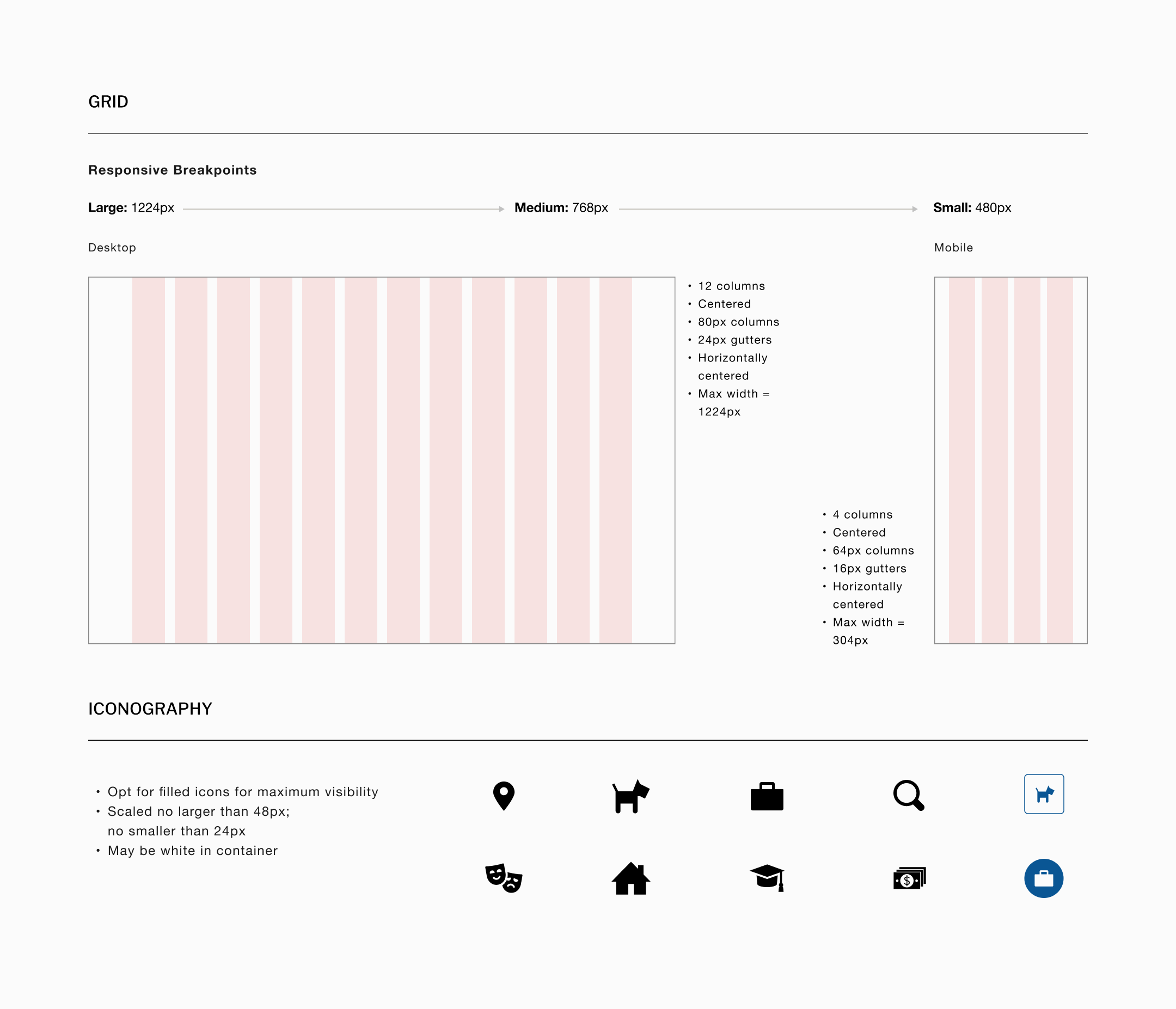
I developed an additional UI kit because the appointment checkout process and information hierarchy were critical to the success of this project, and details such as button states and form elements were important to very clearly define. This new UI kit is designed to append the existing one.
Where it made sense, I leaned into core elements of the existing UI, such as relying on the palette’s primary blues, the global use of Helvetica Neue, and a responsive grid with typical breakpoints.
Where I felt I needed expansion included typographic hierarchy; button formats, sizes, states, and variants; form elements; greater detail with regards to grids; and an approach for iconography.
Understanding What Works and What Doesn’t
High fidelity prototypes allowed me to test the key user tasks I identified in my research. The full application of the UI revealed that while the tasks remained relatively straightforward, some elements warranted reconsideration. Many test subjects, for example, reacted negatively to the “countdown clock,” which held appointments while they completed forms. Similarly, the amount of information and its groupings on the confirmation screens caused some confusion.
› Open Figma desktop high-fidelity prototype in new window
› Open Figma responsive view high-fidelity prototype in new window

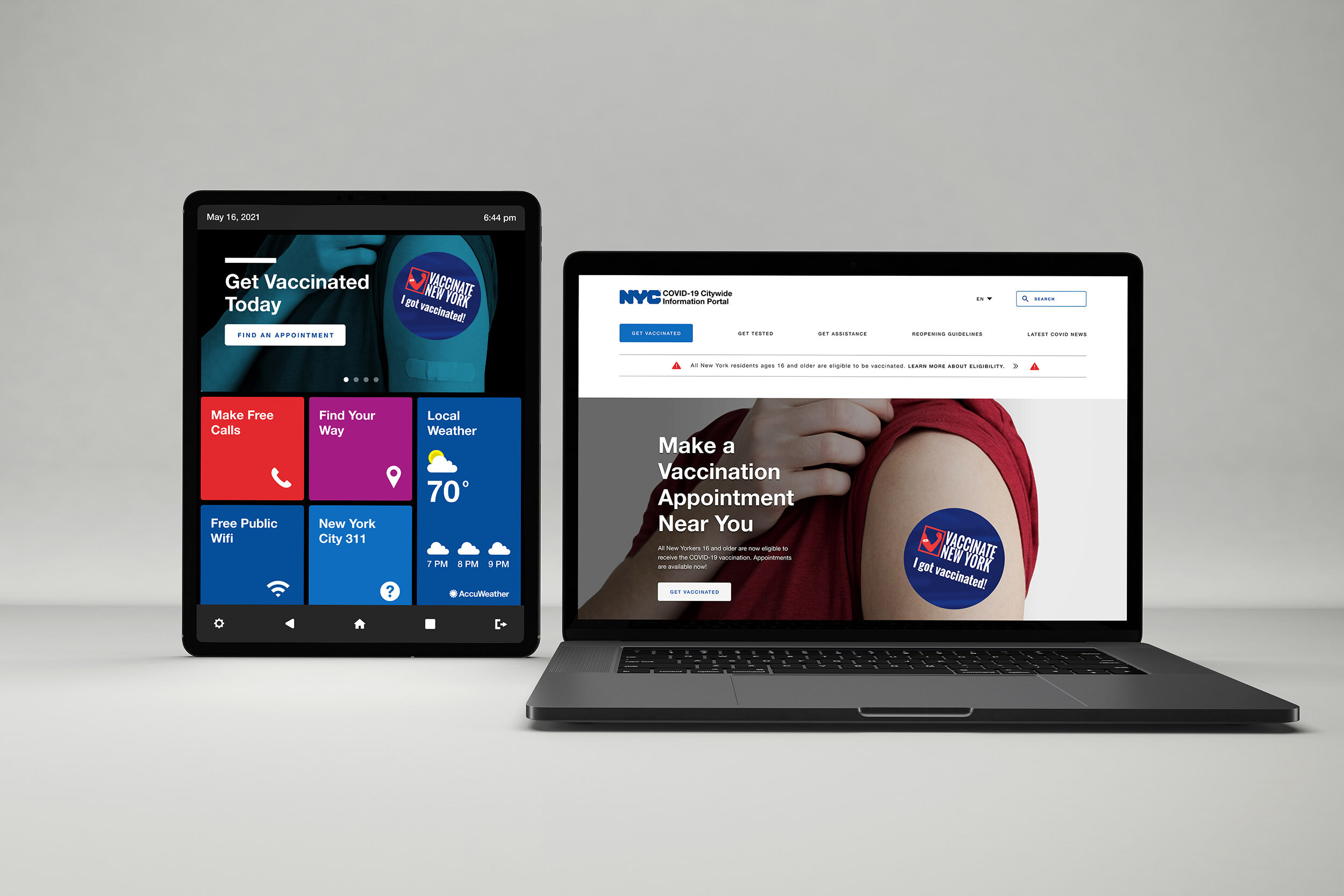
Extending the Product’s Reach Through a Kiosk App
Creating a prototype for the city’s LinkNYC kiosks (nearly 2,000 are installed across the five boroughs) allowed me to a test a minimum viable product meant to serve an audience that may not have access to digital devices or might be homeless. Test users completed the two basic tasks — find a nearby walk-up site or call for help — with relative ease. Some concerns that were raised included needing guided directions, or physical assistance, getting to the location. There was also some concern about button states and whether they were clear enough.
Summary
When NYC began distributing COVID-19 vaccines, it didn’t account for frustrating individual sign-up protocols, or those without digital access. As a result, many couldn’t find vaccination appointments, despite constantly trying.
By understanding who the users are, and why they were having problems, I was able to reimagine a COVID-19 vaccination appointment site experience that helped them find information quickly, and make appointments.
The relative importance of the information they sought and pain points in the appointment finding process came through in the research and testing. This informed an optimized landing page and vaccine finder that cut through the clutter that exists today.
Lessons Learned
1. Time and reliability are key factors
New Yorkers quickly gave up on the existing government website because of its inability to make appointments, and went about finding them in any way they could that was fast, simple, and reliable, which became important goals for the redesign.
2. Appointment variables are important
Despite how difficult vaccine appointments were to get, users still wanted to control variables for their appointments. Easy-to-use filters and location functions were important elements of the process.
3. Clarity of process and language mattered
Users repeatedly expressed concern about knowing where they were in the appointment process, as well as clarifying vague terms they didn’t understand. Simple language and intuitive phrasing were critical to getting residents to their appointments quickly.