OneStream
Helping customers take control of their streaming services.
With more than 300 streaming service options — and each promising "exclusives" — customers are currently finding costs hard to manage, and programming difficult to find. Research indicates that most people are concerned with costs, aren't sure what they're paying for, and are frustrated trying to find something to watch.
OneStream is based on a simple idea: save money and time by planning interruptions to services you don't need, and scheduling when you want to start up again.
Roles
I assumed the following roles designing this app:
User Experience (UX) Designer
Interaction (IxD) Designer
User Interface (UI) Designer
Visual Designer
Deliverables
Interaction Design:
High-fidelity interactive prototypes for key tasks on iOS
UX/UI Design:
Competitive analysis
User surveys and one-on-one interviews
Personas
User journeys and task flows
Site map
Low-fidelity wireframes
High-fidelity mockups and prototypes
Design system and UI kit
Usability tests and findings
Project Specifications
Duration: 6 weeks
Tools:
Figma
Balsamiq
Miro
Octopus
Photoshop
Illustrator
Overview
Since the early 2000s, cable TV’s share of home entertainment has steadily been eroded by Netflix and the now more than 300 streaming service providers. With every subscription promising exclusives not found on any other platform, customers are finding it hard to say no, and accumulating a stack of streaming costs that they’re not able to keep track of.
Making matters worse, licensing deals for series and movies is a constantly shifting landscape, making it difficult for customers to know what to watch, where. The enormous volume of opaque, shifting information, coupled with the sometimes intimidating process of cancelling subscriptions, is putting consumers at a distinct disadvantage.
Problems
Multiple subscriptions that begin at different times, and each with its own cancellation procedures.
Little to no understanding of what the customer is paying for.
Too much time dedicated to finding something to watch, only to discover that it’s not available.
Proposed Solutions
Pull management of all subscriptions into OneStream, and enable cancellations and account re-establishments through APIs.
Use account data to visualize usage in OneStream reports.
Create search and advanced filtering options that are focused only on services enrolled in OneStream.
By having a single app manage many accounts, a viewer might enjoy Netflix for one month, for example, to finish watching a series, and then pause it the next month to focus on Hulu, and so on.
Research
My research first centered around the competition space in order to understand how other apps are addressing similar issues. More than 100 user survey responses would help quantify what customers are paying for, and what they’re hoping to resolve. And lastly, one-on-one interviews would help me understand users’ journeys and specific issues the app would need to address.
Findings
No direct competition in the subscription management arena, but several attempts at providing programming guides.
Users averaged 5 paid subscription services per month and indicated a high level of frustration with the lack of transparency.
Concerns ran the gamut: from a simple lack of understanding (“I don’t know what I’m paying for”) to a strong desire for better management (“I want to optimize what I’m paying for”).
Finding the right programming to watch was an issue for all, but for different reasons.
Getting Closer to User-Centered Design
Defining Key Differences in Motivations Through Personas
Superficially it might seem that everyone is interested in the same thing: saving money and time … but upon closer inspection the user research made clear that there were divergent motivations.
Creating personas helped bring some clarity to those divergences, which would become important reference points as functions developed.
As research and design proceeded, I focused primarily on two personas because they represented heavy emphasis of two key functions: scrutinizing usage reports and data to make subscription decisions; and reliance on the app’s browse, search, and filter functions for viewing choices.
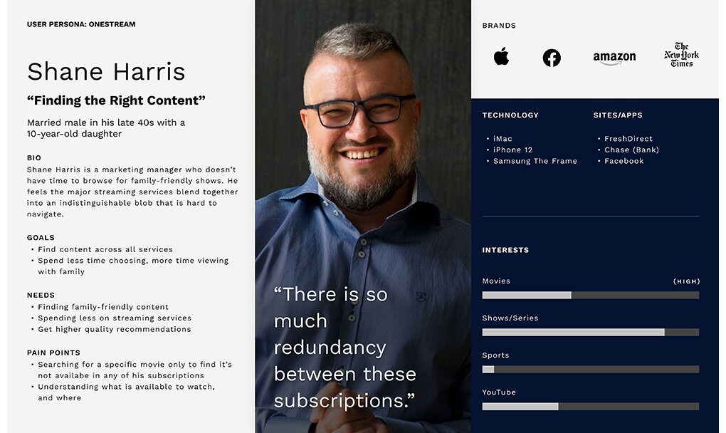
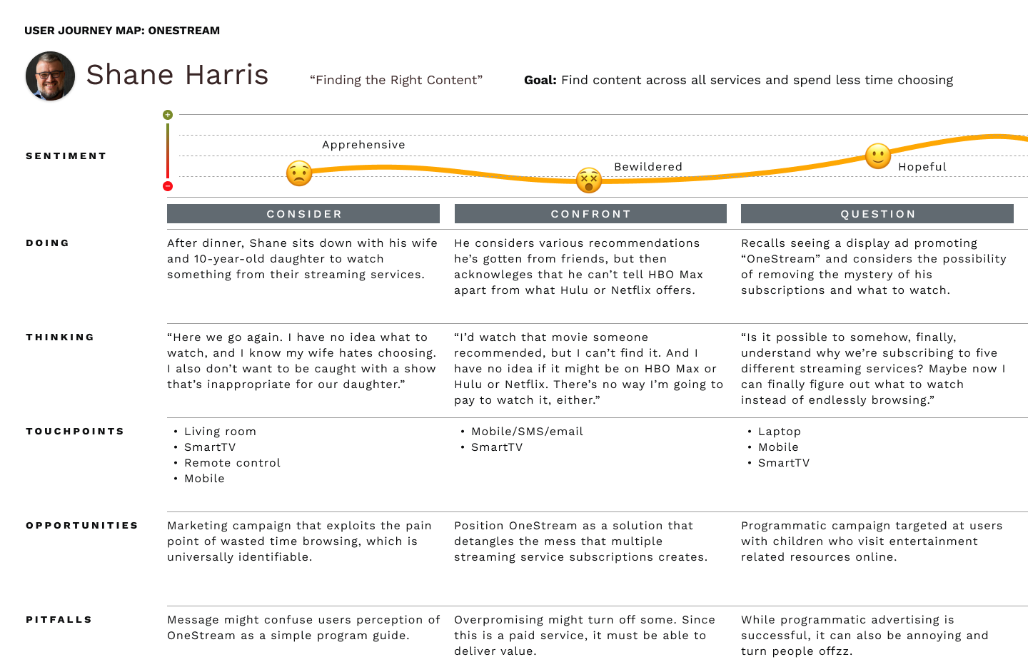
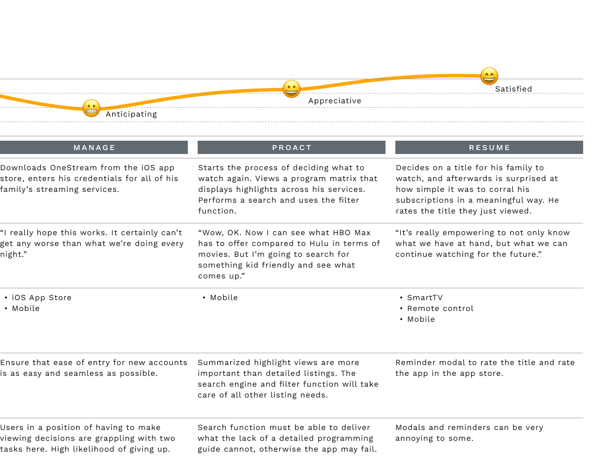
"Shane" wants to be able to find family friendly content, without having to subscribe to any new subscriptions.
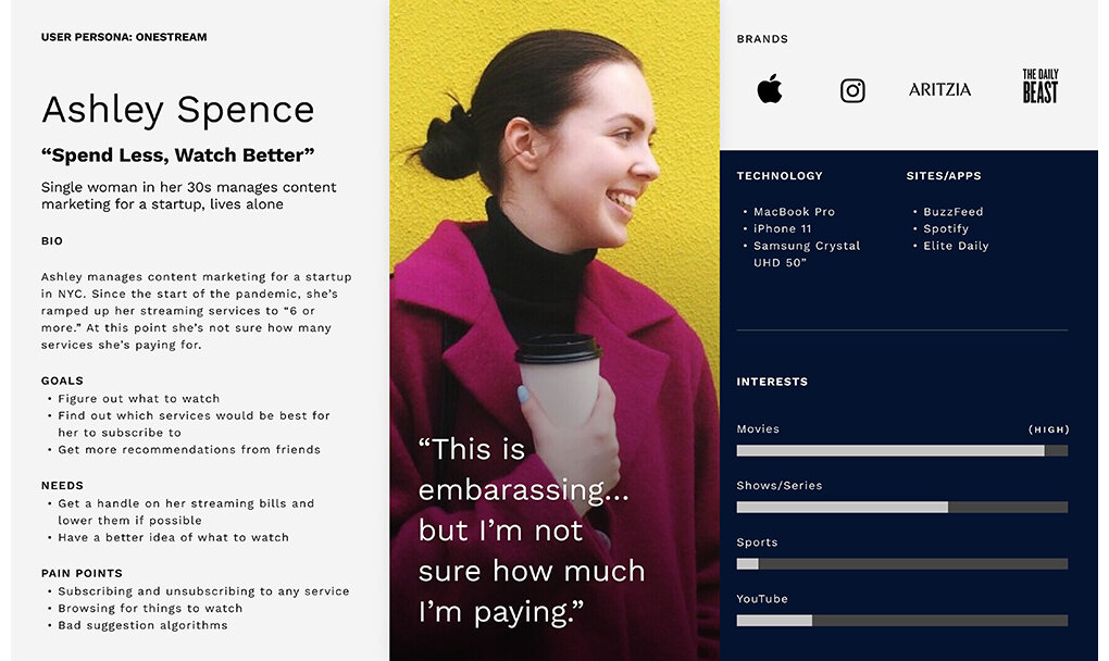
"Ashley" wants to spend less, but she has trouble keeping track of her expenses.
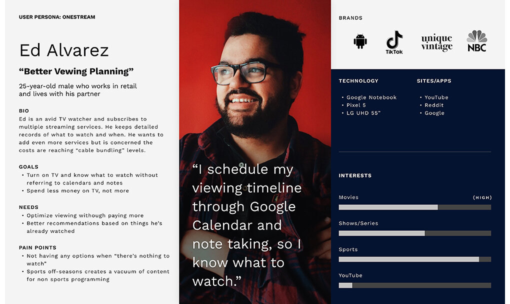
"Ed" is looking for a way to track what he should watch on his paid subscriptions.
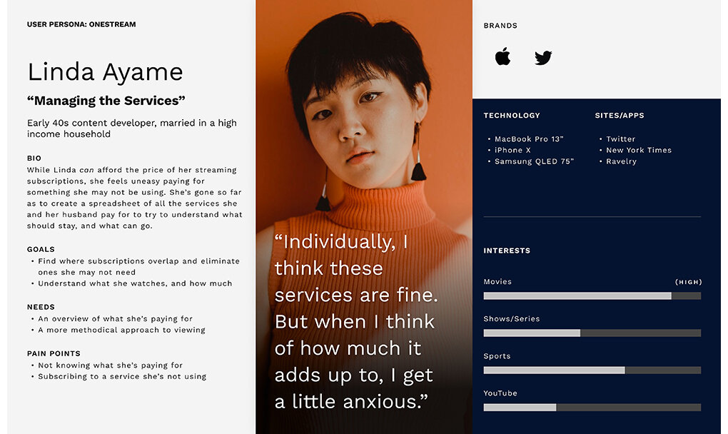
"Linda" is interested in usage, and what she can eliminate.
Exploring Common Tasks in Order to Heighten User Empathy
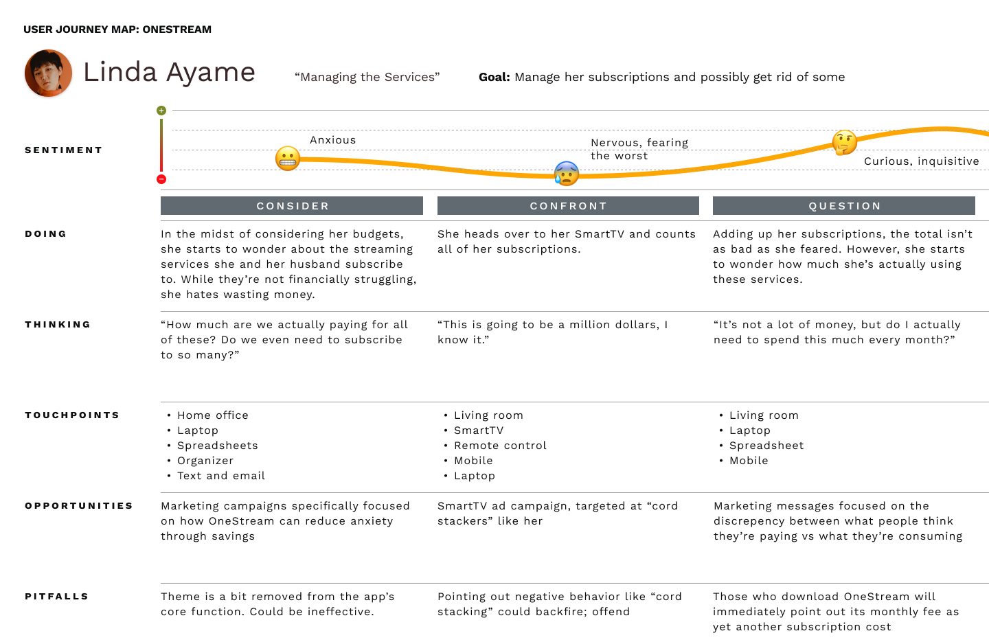
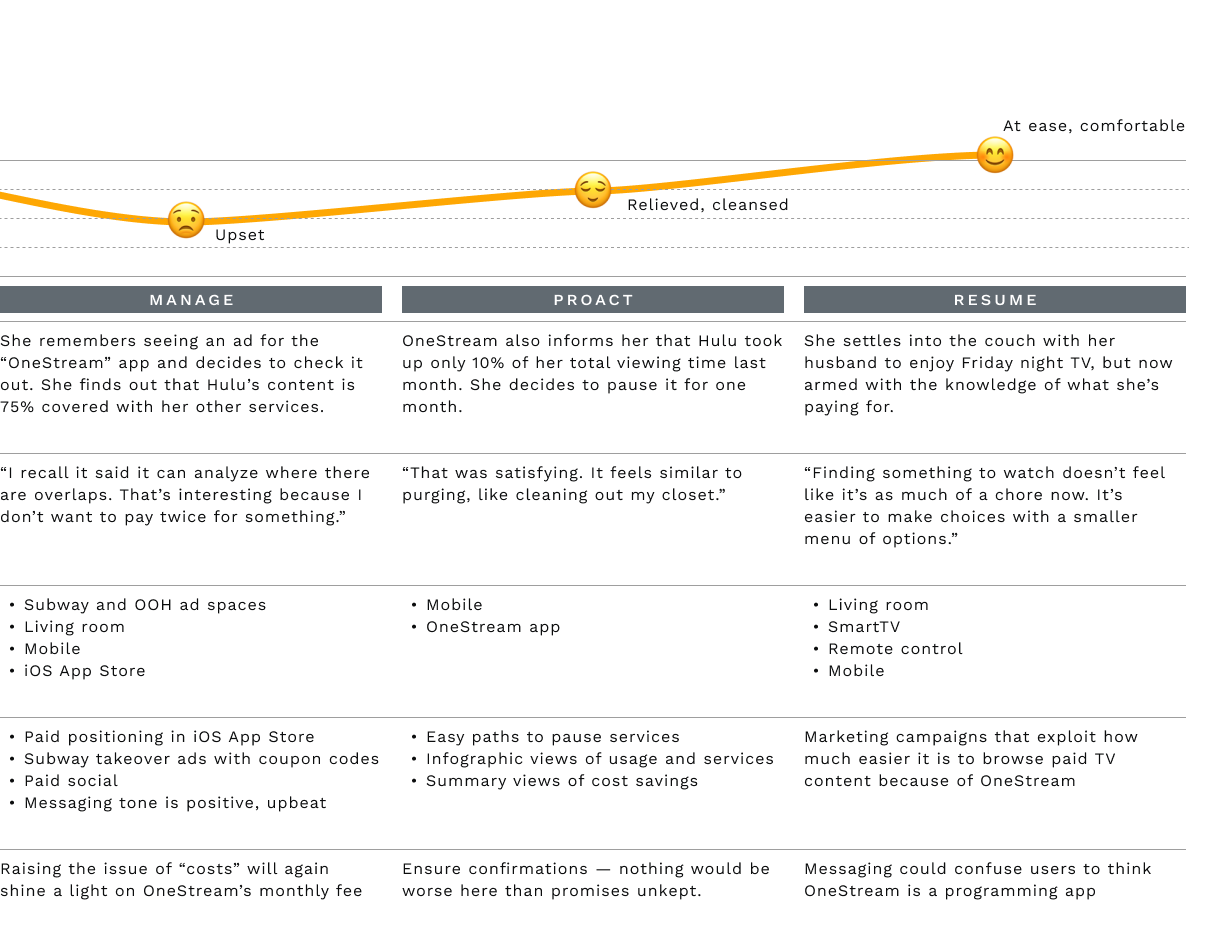
By creating and exploring the journey maps of two personas and their typical tasks, I uncovered key emotional/procedural moments that OneStream needed to address. The anxiety someone might feel, for example, if they’re afraid they’re paying for something they don’t need. Or the dread a parent might sense when they sit down with their children to try and find something to watch. To ensure the app’s stickiness, it would need to overcome these problems … and not introduce new points of friction.
Creating Structure
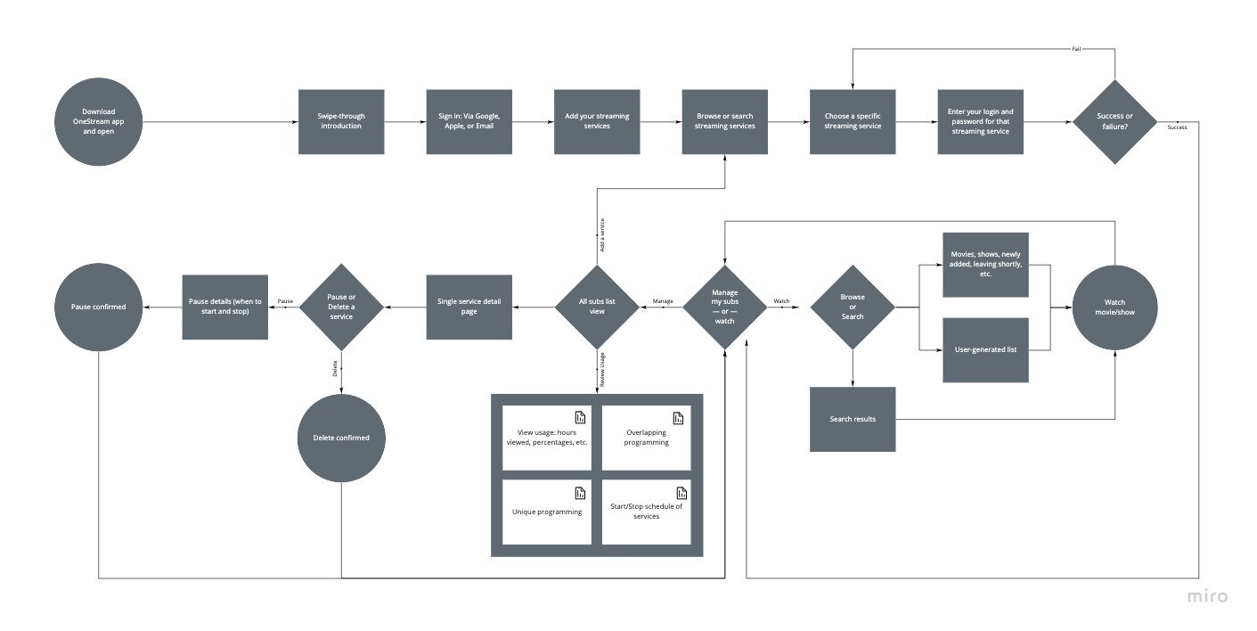
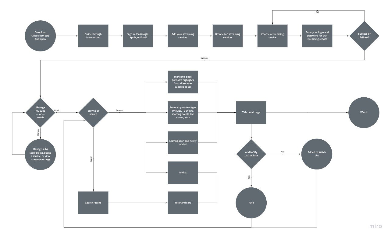
This site map, informed by surveys and interviews, organizationally depicts the three key task streams that the high fidelity prototype would focus on: 1. Onboarding and registration, 2. Management (subscribing and unsubscribing to services), and 3. Programming and search-related functions. The framework the site map provides, along with the user insight collected thus far, would guide design decisions moving forward.

Visualizing a User-Centric Experience
Rapid sketching allowed me to explore design patterns common among apps in the competitive landscape, helping me understand which needed to carry over into OneStream to ensure familiarity. This also helped identify screen types that could serve multiple functions, as well as swiping/touch gestures that would likely be the most intuitive.
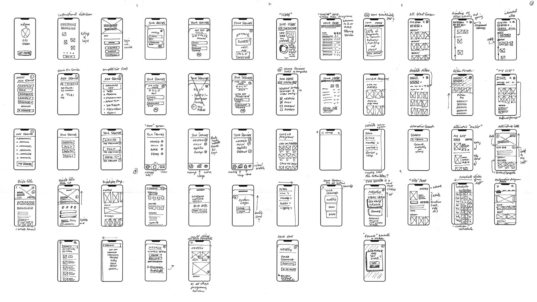
Understanding What Users Find Intuitive, and Why
Low-fidelity prototype testing allowed me to better understand how users expected to complete the tasks I was focusing on. By studying their touch and swipe gestures — and more importantly, having a dialogue with them about what they expected and when — I knew which adjustments needed to be made to lay the foundation for a more fully realized high fidelity prototype. Small details such as actionable and consistent iconography, and consistent paths to get back, would become important elements of the design system.

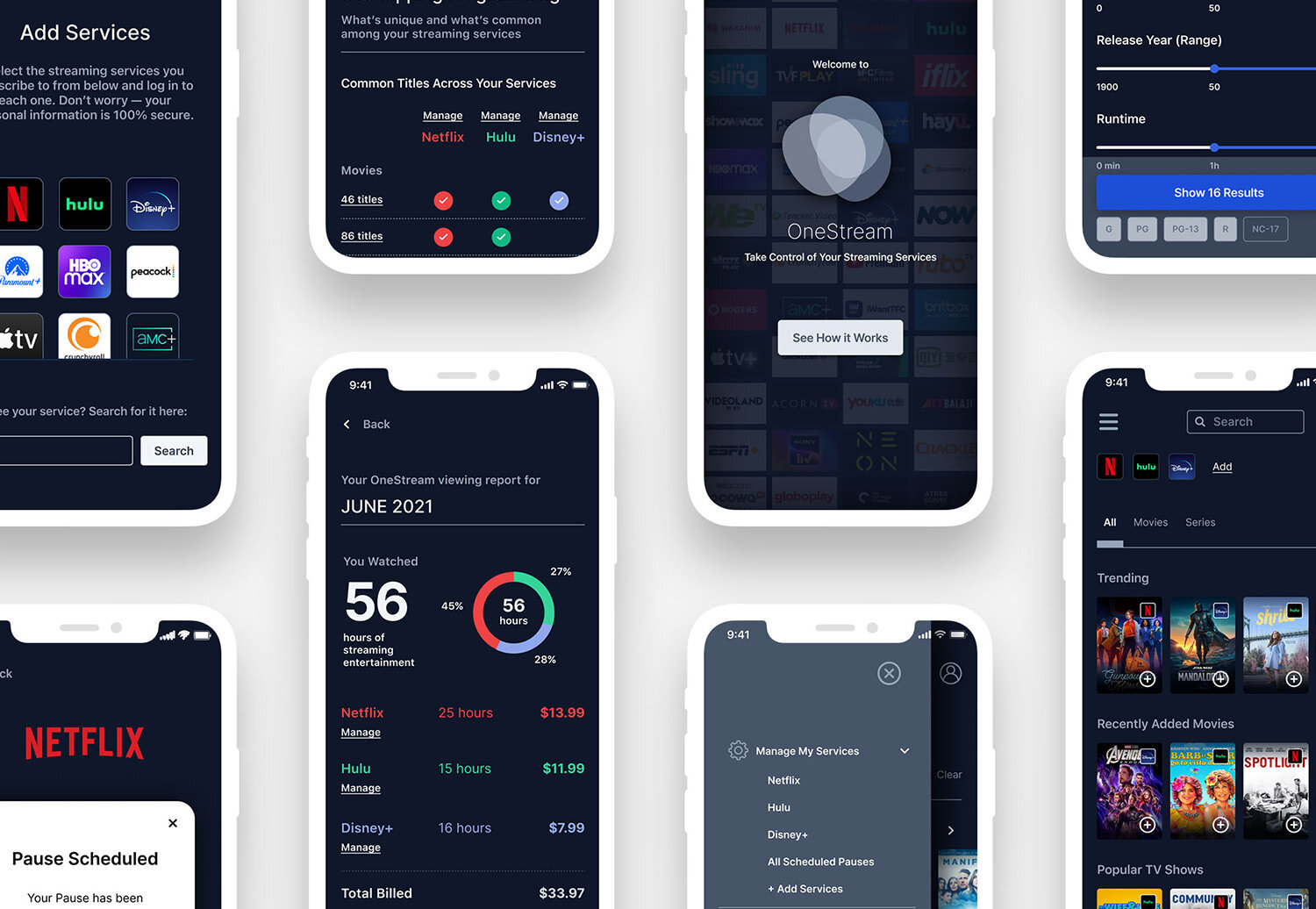
Sample low-fidelity screens depict onboarding and pause management functions.

Reporting views detail usage, overlaps, and pause schedules.

An overview screen layout serves multiple purposes, including results from searches and filter refinements.
Surfacing New Issues
The high-fidelity prototype brought test users closest to the real experience yet, and it revealed some issues. While users were able to complete the onboarding experience, the realistic nature of it revealed some apprehension. Security, privacy, what happens if they forgot their passwords, suspicion … these were among the topics raised by test subjects. They were also able to verbalize a need they hadn’t thought of before this iteration: Could the app somehow visualize the value they are receiving from each of the streaming services they subscribe to — yet another piece of information that could empower them to make better decisions about what makes sense financially.
(Clickable prototype to the right, and also available on Figma)
Establishing Visual Design
Visually articulating all potential aspects of the OneStream brand (product, as well as marketing and beyond) meant defining a baseline design system that identified key elements of its visual vocabulary. I wanted OneStream’s visual design to always refer back to its core mission: Empowering streaming services customers.
Predominantly blue palettes imbued screens with a sense of calm and control; simple button states and clear iconography would help make tasks feel more manageable; and a single, modern sans-serif with large, open counters ensured legibility and clarity in messaging.
(View the design system below, or on Figma)
Iconography

Buttons: sizes and states

Buttons: variants

Forms: overview

Forms: interaction states

Buttons: color

Grids

Typography
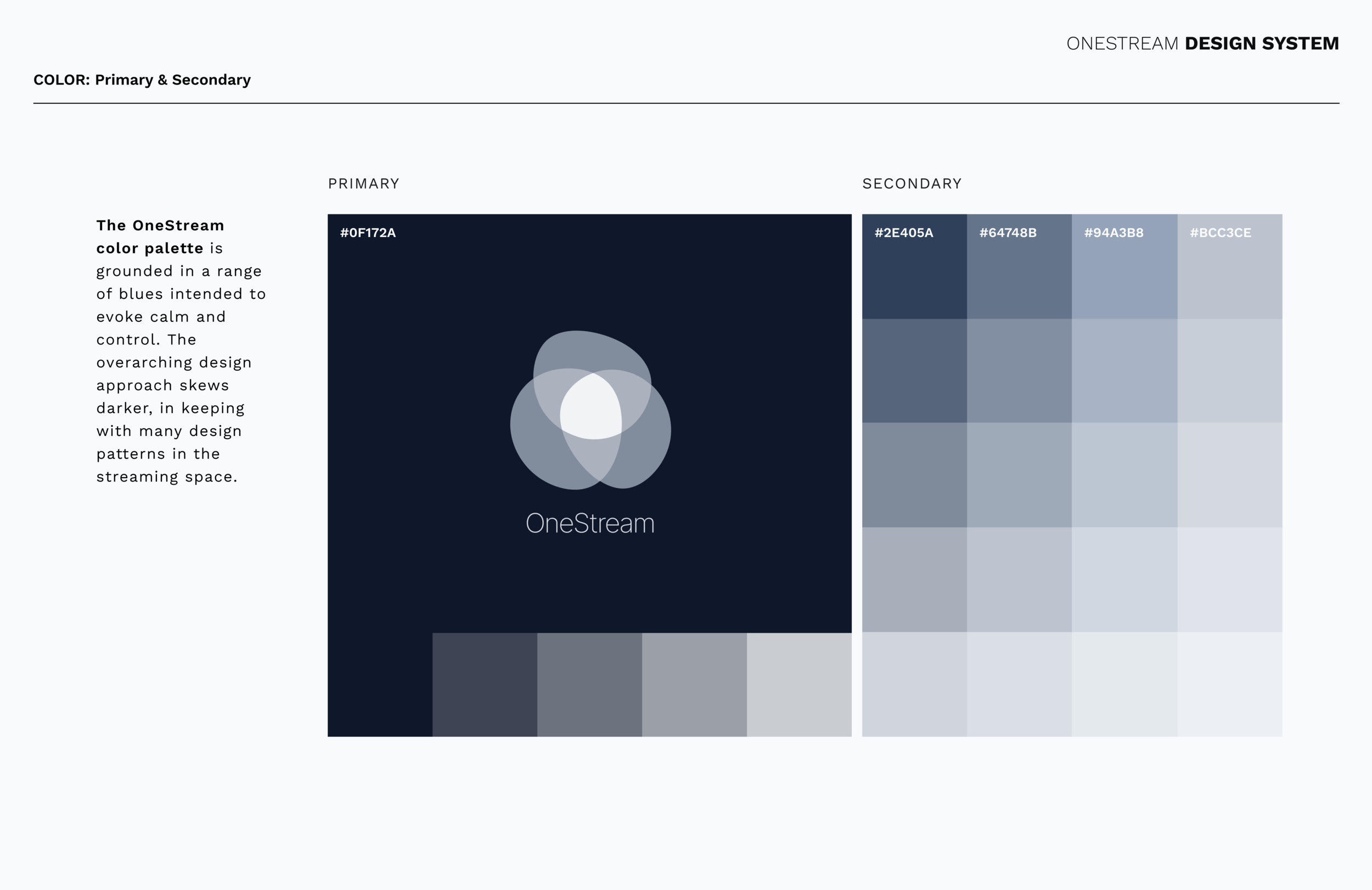
Primary and secondary colors

Greyscale palette
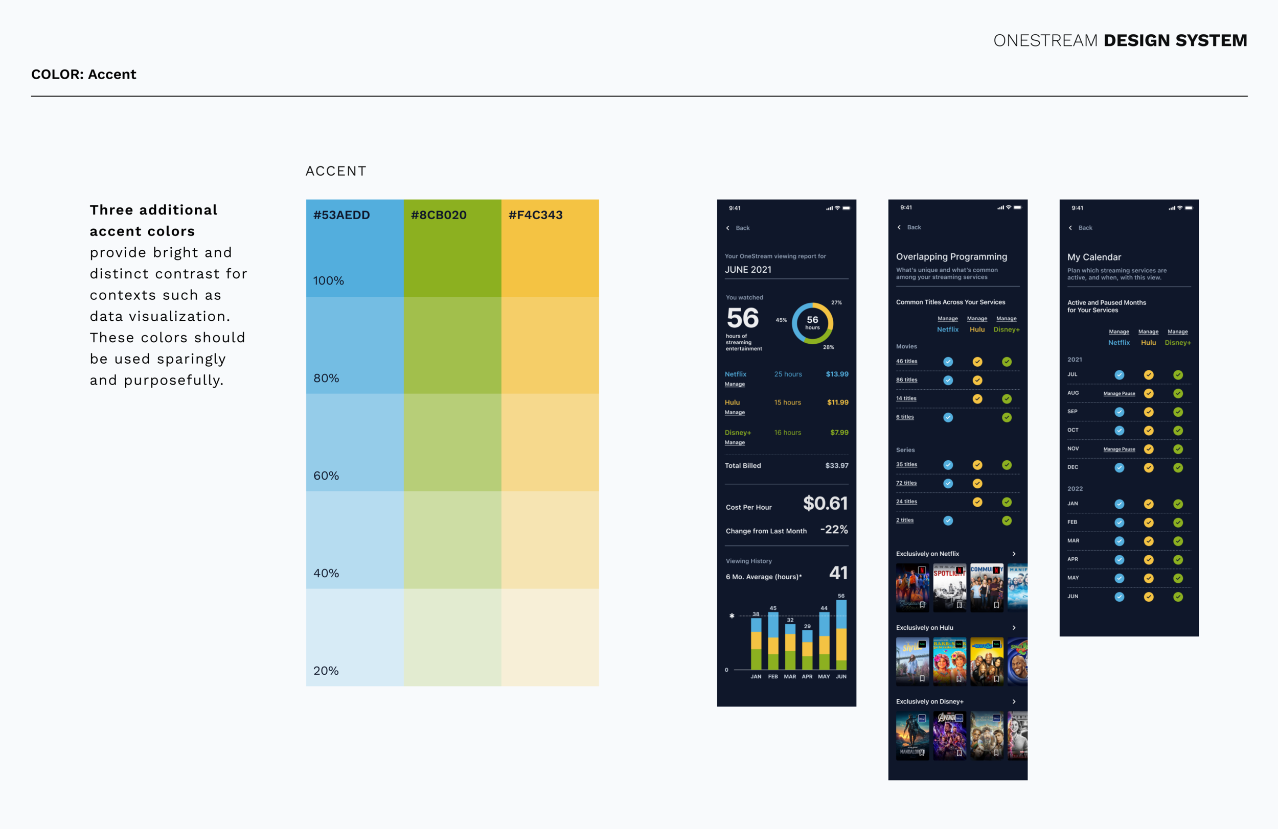
Accent palette

Gradient usage
Logo usage
How Usability Might Be Improved
Issues to Address for Longer-Term Development
More advanced filtering functions to fine tune viewing options based on available subscriptions.
New measures to analyze the “value” of an existing subscription, e.g., the ratio of positively reviewed content to hours streamed, or the types of content consumed.
Greater data visualization to aid in subscription decisionmaking.
Prompts to encourage providing data that would improve functionality (e.g., “Please rate the 5 movies you watched last week.”)
Algorithms specific to one’s paid subscriptions and viewing habits, that can recommend other titles.
Clearer confirmation messages that the APIs are actually managing individual subscription profiles and costs.
Lessons Learned
I went into this project assuming the app would only provide a single function: to pause and restart subscriptions. I learned very quickly, however, that users needed information they didn’t have access to, in order to make those decisions.
Sharing sensitive information — like credentials for other accounts — raised people’s suspicions. That the app itself promised to reduce bills created additional doubt. The app needed to address these fears through thoughtful copy on key screens, and offer explanations as well as a means for reaching support.
People search for things to watch in many different ways, and if those variables are available for filtering purposes, they would rather have more, not less options.
My original intent for the “viewing reports” was to make them neutral, i.e., present data as is. While users found them interesting, they expressed a desire for the reports to tell them what to do. If the issue is potential waste of money, for example, people wanted the app to tell them how they could make the most of what they had; or let them know what action to take in order for them to save money.