Venmo Microloans
Introducing a new feature to the popular mobile payment service: Borrowing and investing with friends
Venmo, a popular peer-to-peer (P2P) payment platform, is often used for simple transactions like splitting dinner checks between friends — transactions that wind up on its social media feed illustrated through irreverent emojis. Since its inception, the 12-year-old company has expanded with services like its debit MasterCard and business payment capabilities. This case study proposes further expansion into the investing and borrowing space in order to increase revenue, while maintaining Venmo’s simplicity and leveraging its social nature.
Roles
This is a concept project where I assumed the following roles:
Interaction (IxD) Designer
User Experience (UX) Designer
User Interface (UI) Designer
Deliverables
Interaction Design: High-fidelity interactive prototype for key tasks on iOS
UX/UI Design:
Competitive analysis
User surveys and one-on-one interviews
User personas
Task flows
Journey maps
Site maps
Low fidelity wireframes and prototype
High fidelity prototype
Usability tests and findings
Project Specifications
Duration: 4 weeks
Tools:
Figma
Balsamiq
Maze
Miro
Octopus
Photoshop
Illustrator
The Opportunity
Competitive analysis revealed that Venmo occupies a unique position in the P2P market — it does one thing (payments to friends) very well, and in a way that's unique and appealing to its audience. Leveraging that appeal of easy financial transactions among friends into a microlending space could create demand for services that typical Venmo users might otherwise avoid, and create a new revenue stream for Venmo through loan interest payments.
While several online platforms already exist that connect lenders to borrowers for microloans, the borrowers are typically impoverished people in underdeveloped countries. No service seems to exist currently in the US where friends fund loans to each other in a closed network, earning interest for the friend-lenders.
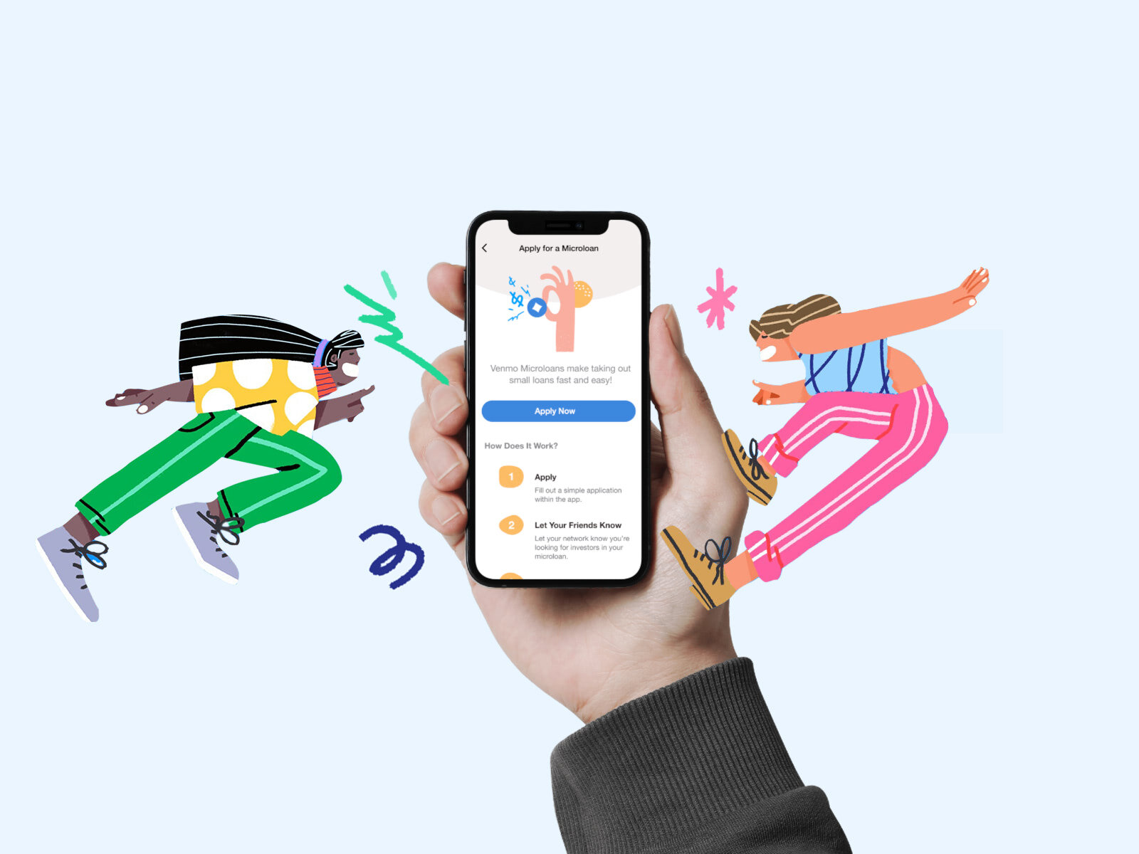
Proposed Features
Paths to loan money to friends’ causes as a means of investment
A simple and intuitive process for Venmo users to apply for loans
A social feed that incorporates microlending transactions
Design Approach
Design screens that highlight groups of loans, as well as individual ones, and a checkout path for investments
Take loan seekers from an introduction to an application sequence that can be completed in a minimal number of screens
Mirror the Venmo payment process where users are prompted to post their transactions on the social feed
Research
My research included competitive analysis to better understand the UX of P2P payment platforms, and the flows of crowdfunding and microlending sites. User surveys helped me identify the right variables for borrowing and lending, and their motivating factors. Lastly, one-on-one interviews provided qualitative and emotional insight into key points of users’ journeys.
Findings
Loan preferences averaged less than $10,000 with a one-year maturity.
Earning interest was a key motivator.
Most users engaged with Venmo's social feed to some degree.
Users wanted separation between Venmo's payment transactions and investment or loan paths.
The idea of "causes" created some apprehension, and in some cases, confusion, with the kinds of charitable donations more often associated with crowdfunding platforms like GoFundMe.
Leveraging Venmo's unique appeal to create a new type of financial transaction requires hitting a sweet spot that is not as easy as it seems: equal parts pleasant and fun, but also legitimate and valid.
Deepening User Empathy
Armed with a better understanding of how customers feel about potentially borrowing and lending within Venmo, I felt it was important to define those two sides of the personas I'd be using to drive design decisions moving forward: investor and borrower.
Defining the qualitative details of someone who was interested in lending toward a cause vs. for a pure investment helped me better understand how design would need to support both. Similarly, creating a borrower persona for an entrepreneur looking to raise seed money, as opposed to one attempting to raise money for a medical cause, helped me appreciate how wide a range I’d need to address.
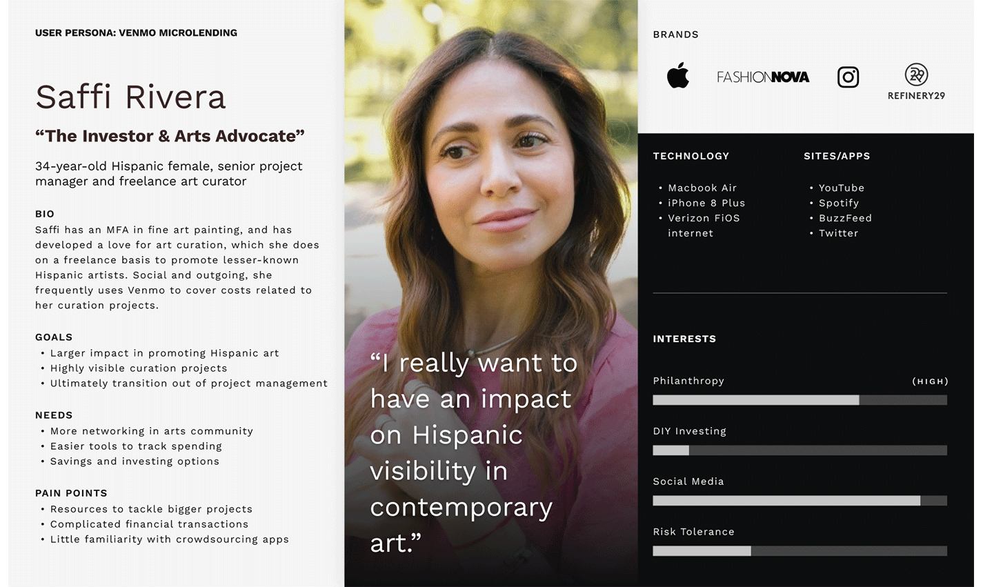
(1 of 4) Investor: Cause-Driven
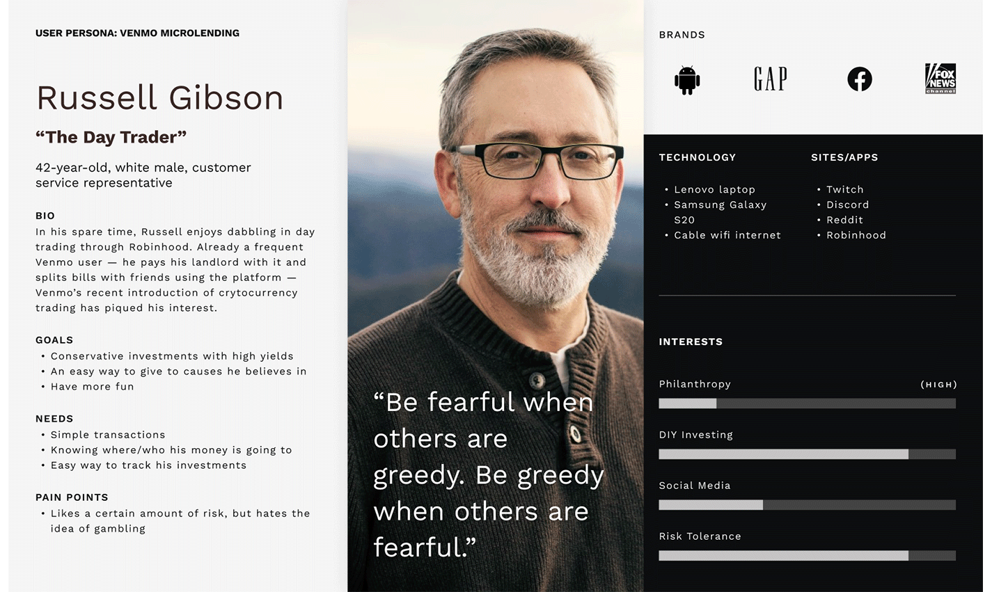
(2 of 4) Investor: Profit-Driven
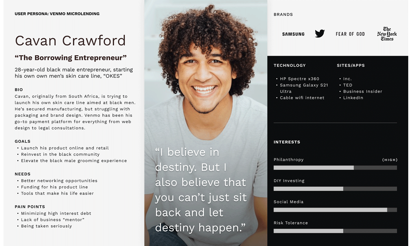
(3 of 4) Borrower: The Entrepreneur
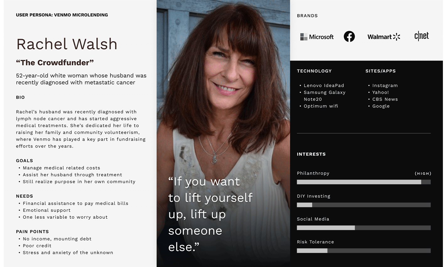
(4 of 4) Borrower: The Crowdfunder
Understanding the Journey
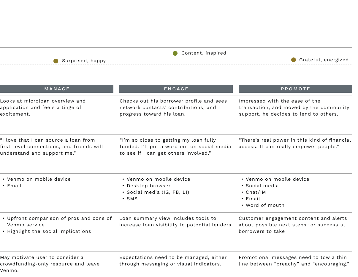
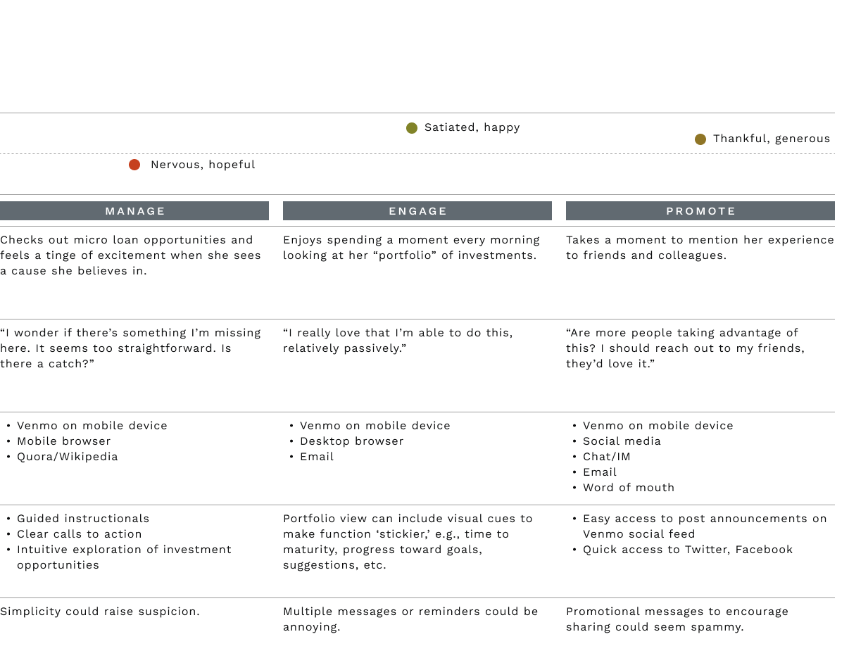
Creating two journey maps — one defining the investor, another for the borrower — revealed emotional nuances of different points of interaction that could be addressed in the microlending paths. Financial transactions, even on a small scale, can be a source of anxiety; how information is presented and paths defined could make a difference in whether users abandoned a microlending opportunity. So, in pushing design forward, it was important to maintain the existing flat site structure to minimize disruption, and ensure that various points in the task flows for borrower and investor addressed concerns like this.
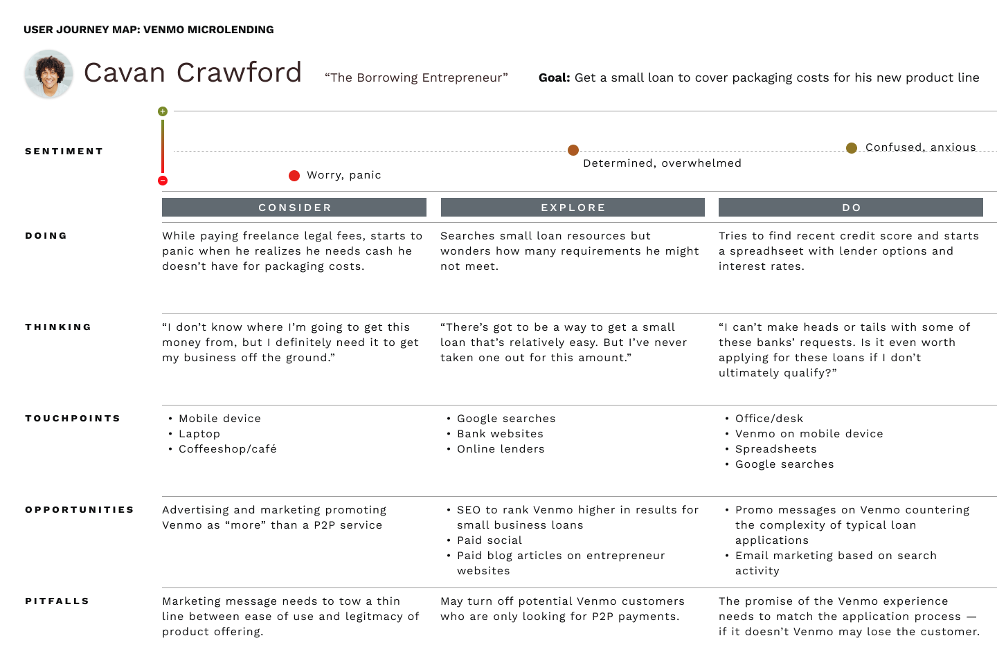
User Journey: Borrower
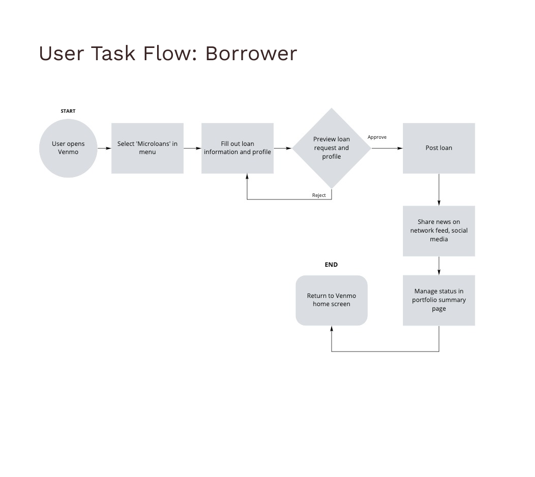
Task Flow: Borrower

User Journey: Investor
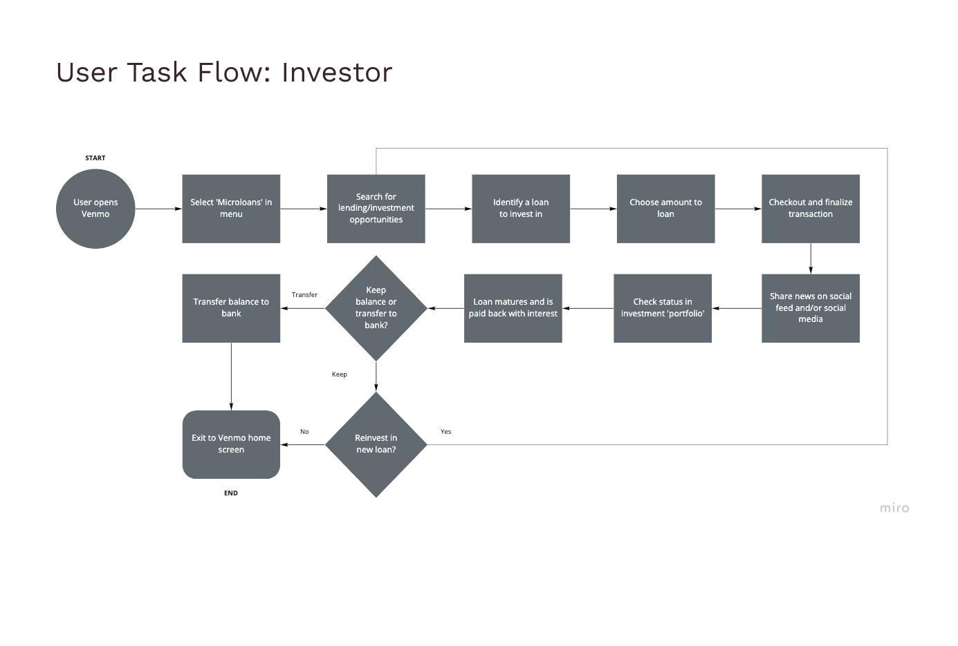
Task Flow: Investor
Visualizing a Seamless Integration
Several rounds of rapid sketching on paper revealed the challenge of keeping key tasks simple, and at a single level. This exercise was important in discovering which existing design patterns within Venmo made sense, and how users would navigate between screens.
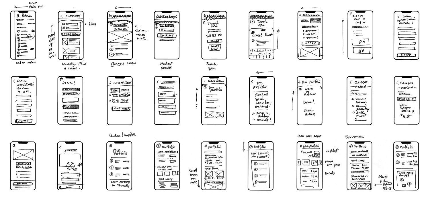
Identifying Points of Confusion through Wireframe Prototypes
After sketching, I translated the flows into low fidelity, clickable wireframes. These revealed some sticking points for the users I tested with. Many were confused when faced with choosing the differentiated path of investing vs. borrowing. Others were stuck on terms (e.g., "cause" vs. "loan"). Still others identified anxiety that surfaced when they realized they were parting with their money, or were uncomfortable with finance in general.

Revealing New Shortcomings Through High-Fidelity Prototype Testing
Due to time constraints, I decided to take what I learned during the wireframe tests, and move directly to a high-fidelity prototype. My strategy was to address the specific points of friction through careful attention to copy and to make sure the design patterns I’d apply were as clear as possible — and consistent with the overall Venmo experience.
Testing was generally successful — most tasks were completed by testers at a success rate of 72% or higher. The path to apply for a loan, however, failed. At the point of realizing what they were about to commit to, users either bounced, or seemed to click back and forth between disclosures and the approval step. Qualitative feedback also revealed several users' issues with better understanding the relationship between their "friends" and "borrowers," or financial literacy in general.
Potential usability improvements included:
A clearer walkthrough of how microloans work and their benefits, at the landing screen level of the task flows.
The ability to gain a deeper understanding of the investment terms during that flow; e.g., interest terms, loan maturities, Venmo guarantees (if any).
Greater highlight to the relationship of the lender to the borrower, as opposed to the cause.
Explaining exactly what happens (and when) once a loan application is submitted.
Next Steps
Taking a step back to possibly reconcept the entire cycle of investing and borrowing on a micro level, and paying careful attention to how the concept is framed, named, and described would be among my high priority next steps.
I would also take much greater care to make sure there was reassuring and legally affirming language to address the hesitation many faced during the investing and borrowing tasks.
Specifically, several subject areas in the current iteration will need to be worked into the user flows:
Explaining who bears the risk of the loans, and how guarantees work.
How microloans among peers work differently than other loans
What happens to a loan and its investors if it isn't fully funded
A breakdown of fees and who is charged
Lessons Learned
One test user commented that the tasks were "almost too simple." Like many others, the transactions were correctly executed but their simplicity left a lot of room for speculation and doubt. The following are just some of the lessons I learned through this process:
The spectrum of financial literacy—even within a targeted audience—is vast. The UX and UI need to work together to address the most sophisticated investor, or someone who's never even opened a savings account.
While it goes without saying that copy is important, it is particularly critical when describing simplified financial transactions. Even the term 'microloans' wasn't entirely clear to some, so the starting point was already opaque.
A concept that blurs the line between crowdsourcing, investing, and lending — wrapped inside a payment platform — drew confusing parallels with other platforms. That clarity needs to somehow be achieved.